Android cheatsheet for graphic designers
Graphic designers aren't programmers and sometimes don't know how to properly prepare graphic assets for developers. This simple cheatsheet should help them to do their job better, and to simplify developers' lives.
Dimensions
Screen densities and icon dimensions
| Qualifier | DPI | Scaling factor | Launcher icon | Action bar, tab icon | Notification icon (API 11) | Notification icon (API 9) | Notification icon (older) |
|---|---|---|---|---|---|---|---|
| ldpi | 120 | 0.75 | 36 x 36 32 x 32 | 24 x 24 18 x 18 | 18 x 18 16 x 16 | 12 x 19 12 x 12 | 19 x 19 16 x 16 |
| mdpi | 160 | 1.0 | 48 x 48 42 x 42 | 32 x 32 24 x 24 | 24 x 24 22 x 22 | 16 x 25 16 x 16 | 25 x 25 21 x 21 |
| hdpi | 240 | 1.5 | 72 x 72 64 x 64 | 48 x 48 36 x 36 | 36 x 36 33 x 33 | 24 x 38 24 x 24 | 38 x 38 32 x 32 |
| xhdpi | 320 | 2.0 | 96 x 96 84 x 84 | 64 x 64 48 x 48 | 48 x 48 44 x 44 | 32 x 50 32 x 32 | 50 x 50 42 x 42 |
| xxhdpi | 480 | 3.0 | 144 x 144 126 x 126 | 96 x 96 72 x 72 | 72 x 72 66 x 66 | 48 x 75 48 x 48 | 75 x 75 63 x 63 |
Notice: the first icon dimension in table cell is full asset size, the second icon dimension is optical square. Dimension values are in pixels.
Tip: creating ldpi assets is not really needed anymore. The devices are rare and the platform will just scale down mdpi.
Google Play asset dimensions
| Asset Type | Required | Image type | Dimension |
|---|---|---|---|
| Screenshot | yes | JPEG or 24-bit PNG (no alpha) | min length for any side: 320 px max length for any side: 3840 px |
| High-res app icon | yes | 32-bit PNG (with alpha) | 512 x 512 px |
| Feature graphic | no | JPEG or 24-bit PNG (no alpha) | 1024 x 500 px |
| Promotional graphic | no | JPEG or 24-bit PNG (no alpha) | 180 x 120 px |
| Video link | no | URL of YouTube video | - |
Dimension units
| Unit | Units / physical inch | Density independent | Same physical size on every screen |
|---|---|---|---|
| px | varies | no | no |
| in | 1 | yes | yes |
| mm | 25.4 | yes | yes |
| pt | 72 | yes | yes |
| dp | ~160 | yes | no |
| sp | ~160 | yes | no |
Size buckets
| Type | Dimension |
|---|---|
| Handset | smaller than 600 dp |
| Tablet | larger than or equal 600 dp |
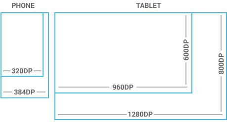
Notice: one dp (density-independent pixel) is one pixel on a 160 DPI screen
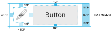
Views dimensions and spacing
Touchable UI components are generally laid out along 48 dp units. Spacing between each UI element is 8 dp.

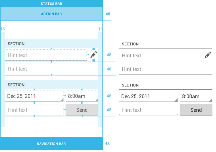
Action bar height
| Qualifier | Dimension |
|---|---|
| Portrait | 48 dp |
| Landscape | 40 dp |
| Tablet | 56 dp |
Text Size
| Type | Dimension |
|---|---|
| Micro | 12 sp |
| Small | 14 sp |
| Medium | 18 sp |
| Large | 22 sp |
Notice: one sp (scale-independent pixel) is one pixel on a 160 DPI screen if the user's global text scale is set to 100%.
Images and themesNine-patch
- Standard PNG image with alpha
- Filename suffix is ".9.png", e.g. "btn_login_normal.9.png"
- Image has an extra 1 pixel wide border, used to define the stretchable/static/padding areas
- Stretchable sections are indicated by 1 px wide black line(s) in the left and top part of the border
- Static sections are indicated by fully transparent or white pixels
- Padding area (optional) is indicated by 1 px wide black line in the right and bottom part of the border

Colors
Use color primarily for emphasis. Blue is the standard accent color in Android's color palette. Note that red and green may be indistinguishable to color-blind users. Primary colors are as follows:
- #33B5E5
- #AA66CC
- #99CC00
- #FFBB33
- #FF4444
- #0099CC
- #9933CC
- #669900
- #FF8800
- #CC0000
Holo themes
Android provides three system themes:
- Holo Light
- Holo Dark
- Holo Light with dark action bar
Naming conventions
Naming conventions for drawables
File names must contain only lowercase a-z, 0-9, or _.
Drawables for the specific views (ListView, TextView, EditText, ProgressBar, CheckBox etc.) should be named like this views keeping the naming rules, e.g. drawable for CheckBox should be named "checkbox_on_bg.png".
| Asset Type | Prefix | Example |
|---|---|---|
| Action bar | ab_ | ab_stacked.9.png |
| Button | btn_ | btn_send_pressed.9.png |
| Dialog | dialog_ | dialog_top.9.png |
| Divider | divider_ | divider_horizontal.9.png |
| Icon | ic_ | ic_star.png |
| Menu | menu_ | menu_submenu_bg.9.png |
| Notification | notification_ | notification_bg.9.png |
| Tabs | tab_ | tab_pressed.9.png |
Naming conventions for icon assets
| Asset Type | Prefix | Example |
|---|---|---|
| Icons | ic_ | ic_star.png |
| Launcher icons | ic_launcher | ic_launcher_calendar.png |
| Action bar icons | ic_menu | ic_menu_archive.png |
| Status bar icons | ic_stat_notify | ic_stat_notify_msg.png |
| Tab icons | ic_tab | ic_tab_recent.png |
| Dialog icons | ic_dialog | ic_dialog_info.png |
Naming conventions for selector states
| State | Suffix | Example |
|---|---|---|
| Normal | _normal | btn_order_normal.9.png |
| Pressed | _pressed | btn_order_pressed.9.png |
| Focused | _focused | btn_order_focused.9.png |
| Disabled | _disabled | btn_order_disabled.9.png |
| Selected | _selected | btn_order_selected.9.png |
Organizing drawables to directories
One drawable must have the same file name for all screen densities (ldpi, mdpi, hdpi etc.) and all these files must be organized according to density into the following directories. Here's the resources directory structure for drawables:
- res
- drawable-ldpi
- drawable-mdpi
- drawable-hdpi
- drawable-xhdpi
- drawable-xxhdpi


Comments
Post a Comment